Adding a Background to your Experience
In this article you can discover how to add a background image and/or background color to your Experience.
Backgrounds can be set on different levels (from top to bottom, where the lower ones can override the higher ones) :
- Theme-level — Through CSS, which is more technical. Applies to an Experience when the Theme is selected during Experience creation (or added/changed afterward).
- Experience-level — Applies to the Experience.
- Form-level — Applies to a form within the Experience. See Form Section.
- Module-level — Applies to certain modules within the Experience. Examples are the Callout module, Poll module , Headline module, Quiz Results module.
Theme-level backgrounds
You can define a background color or image by using CSS in the Theme configuration.
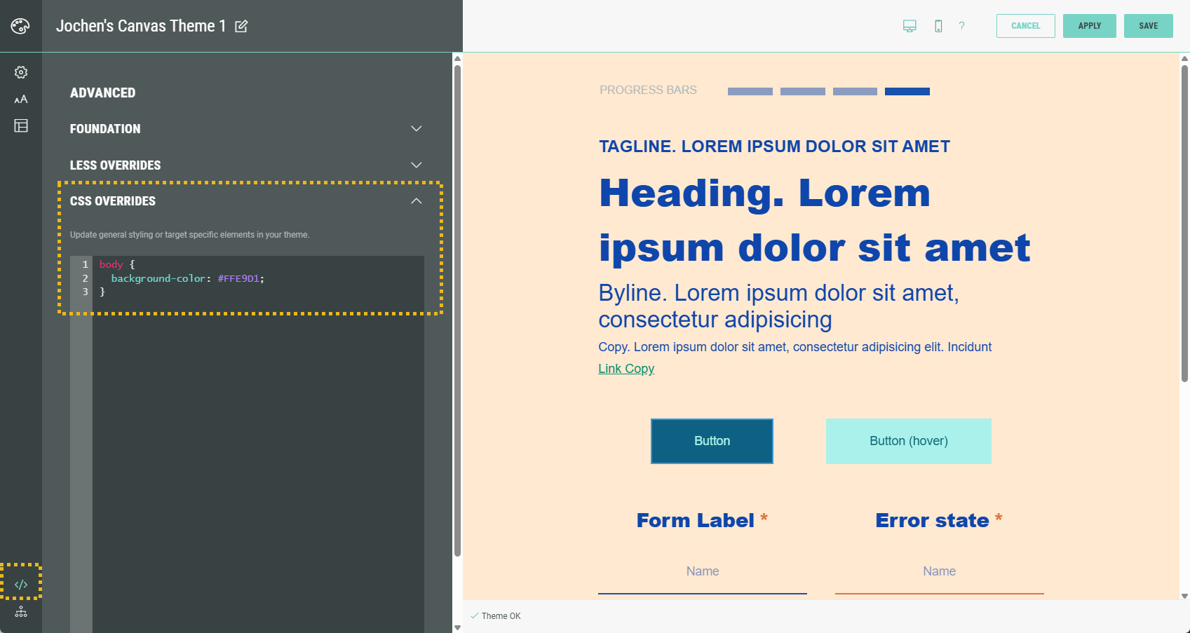
This CSS applies to an Experience when the Theme is selected during Experience creation (or added/changed afterward).
It's useful if you always want to have the same background color/image. It can be overridden by using any of the other level options below.
Experience-level backgrounds
To set a background at Experience-level, from your Experience screen select Design in the left-hand navigation.
Scroll down and click on Background.
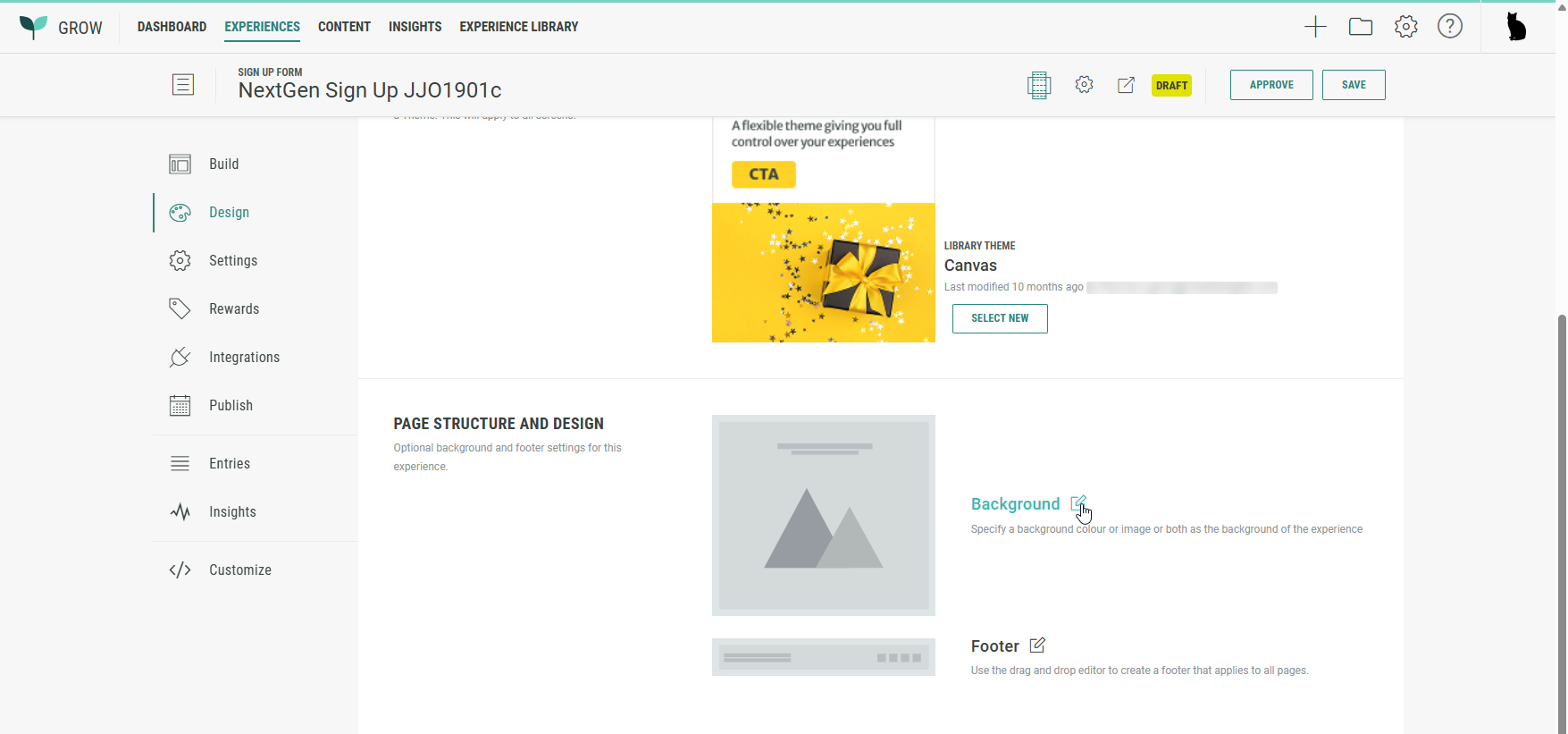
The following screen is shown to edit the background:
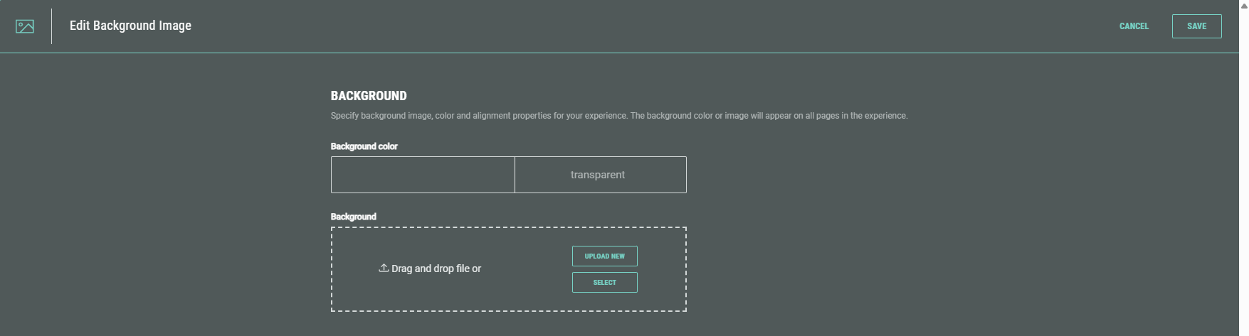
See the applicable sections below on how to set a background color or background image.
Form-level backgrounds
To set a background at form-level, edit the Landing & Entry Page in your Experience and select Form settings in the Form Section.
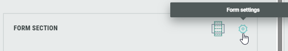
On the Design tab, scroll down to see the Background section.
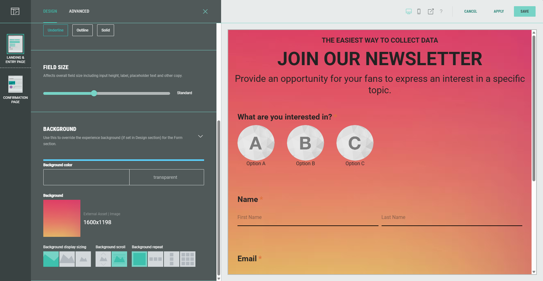
See the applicable sections below on how to set a background color or background image.
Module-level backgrounds
To set a background at module-level, edit any applicable Page in your Experience and edit the module.

Select the Design tab, where the Background section is available.
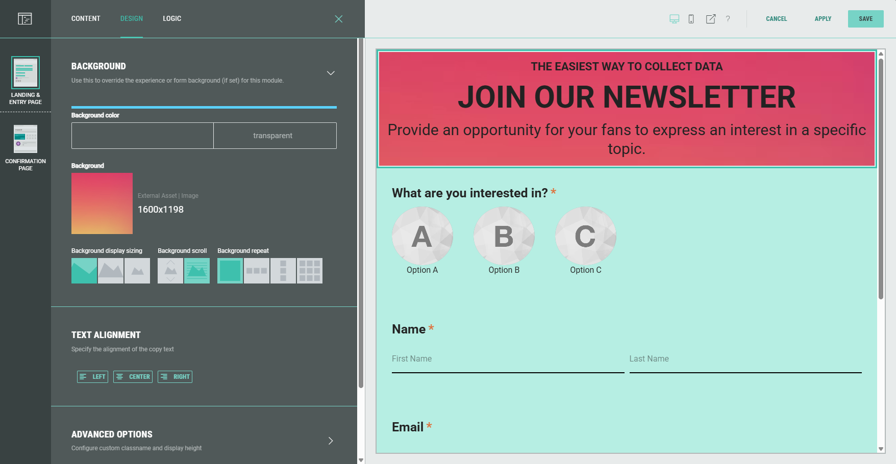
See the applicable sections below on how to set a background color or background image.
Set background color
Note: If a background image is already applied, it first needs to be removed, as otherwise it overrides any background color we set.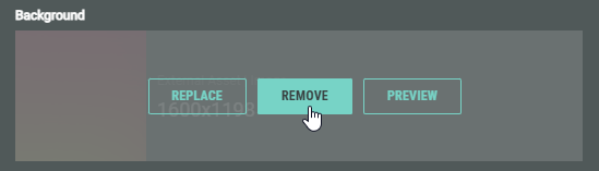
Click on the background color field on the left to see a color selector popping up.
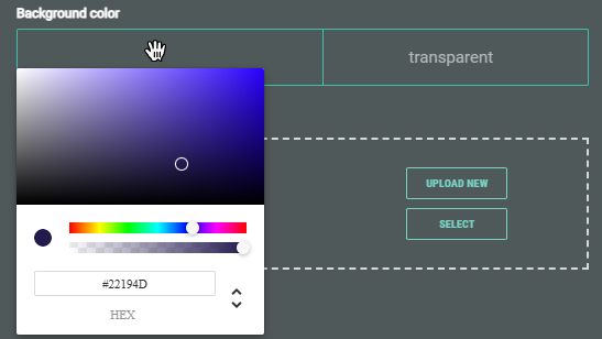
Select the desired color and opacity.
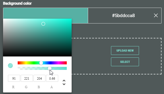
Technical note:
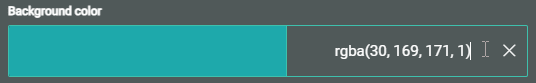
In the color picker, at the bottom, you can manually edit (by typing in the field(s)) and switch between (with the up/down arrows) :
- HEX — The hexadecimal value of the color. (For more info, see this w3schools page.)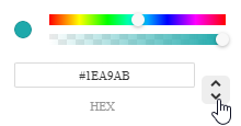
- RGBA — Red, green, blue, and alpha values. (For more info, see this w3schools page.)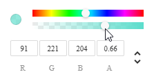
- HSL — Hue, saturation, lightness and alpha values. (For more info, see this w3schools page.)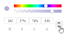
- The HEX or RGBA value is also shown in the field on the right of the color, which you can manually edit by typing.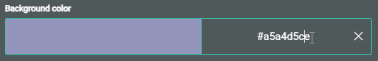
Set background image
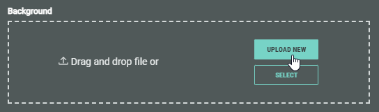
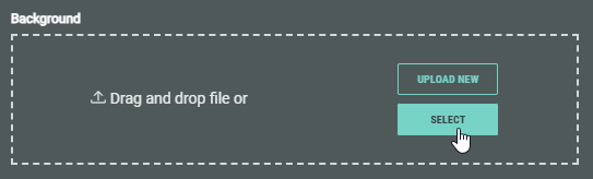
When no background image is set yet, or when an existing one has been removed, you can select a background image or upload a new one.
Upload new image
Click the Upload New button to show a dialog in which you can select an image file to upload (in one of these formats: .png, .jpeg, .jpg, .gif).
Once uploaded, you can see the background image with its details in the Design settings on the left, and the applied image shown in the background of the Experience preview on the right.
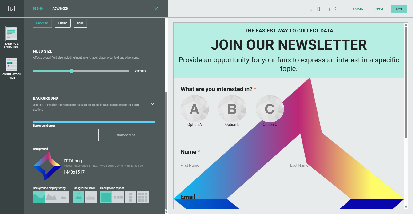
Furthermore, under the Background design settings, additional settings have become available: Background display sizing, background scroll and background repeat.
These are explained below.
Select existing image
Click the Select button to select an existing image.
A pop-up is then shown with the following 3 tabs: Library, Pexels, Experience.
Note: More info on all the image selection options can be found in this article.
Background image settings
When a background image has been set, additional settings become available: Background display sizing, background scroll and background repeat.
These are explained below.
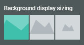
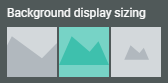
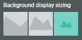
Background display sizing
The following background display sizing options are available:
- Cover automatically fills space while maintaining aspect ratio. The focus will be on the center of the image.
Example: The Zeta logo with dimensions 1440x1517 inside the Headline module.
Background display sizing = cover
- Contain scales the image to maintain its aspect ratio while fitting within the given space. It is ideal for use of irregular design assets and product images.
Example: The Zeta logo with dimensions 1440x1517 inside the Headline module.
Background display sizing = contain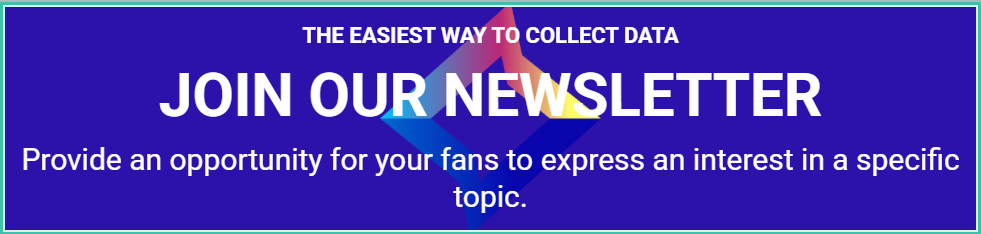
- Native uses the actual image size.
Example: The Zeta logo with dimensions 1440x1517 inside the Headline module.
Background display sizing = native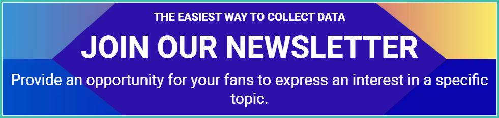
Background scroll
Background scroll allows you to define how the background image behaves when scrolling through the Experience page.
- Scroll with page — While the Experience participant scrolls the page, the background image will scroll with it.
- Fixed position — While the Experience participant scrolls the page, the background image will remain its fixed position, without moving.
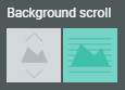
Example: The headphones background shown as scroll with page, versus fixed position.
Background repeat
With background repeat you can configure if and how the background image should be repeated.
- Display once — The background image will only be displayed once.
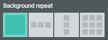
Example: The Zeta icon with dimensions 150x158 is used as a background in Form Section.
Background repeat = Display once (and background display sizing = native).
- Repeat horizontally — The background image will be repeated multiple times horizontally (if its width is smaller than the width of the container).
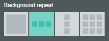
Example: The Zeta icon with dimensions 150x158 is used as a background in Form Section.
Background repeat = Repeat horizontally (and background display sizing = native).
- Repeat vertically — The background image will be repeated multiple times vertically (if its height is smaller than the height of the container).
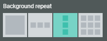
Example: The Zeta icon with dimensions 150x158 is used as a background in Form Section.
Background repeat = Repeat vertically (and background display sizing = native).
- Tile to fill space — The background image will be repeated multiple times horizontally and vertically to fit the entire container (if its width and/or height is smaller than the width/height of the container).
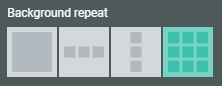
Example: The Zeta icon with dimensions 150x158 is used as a background in Form Section.
Background repeat = Tile to fill space (and background display sizing = native).